Squamish needs an edge that is as rad as the people living there. They need a logo that people are proud to sport on their Nalgene and flat brim hats, something that tells strangers where they’re from without any explanation. Squamish needs a mark that encompasses the array of activity and landscape diversity, and cultural roots. They need a mark that acknowledges the depth of its history, echo’s the fluidity of the waves, peaks, valleys, wind, trail systems and celebrates its rich depth of culture.
01/2022
Awards:
DesCan Salazar Award Honourable Mention, 2022
RGD Branding Honourable Mention, 2022
Project Type: Branding, Way-finding
Instructor: Mike Cober
CURRENT LOGO:

IDEATION:
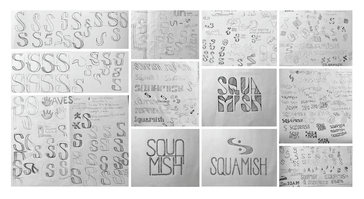


Process
Above is an obituary of all the dead S's. Somewhere between my first and third attempt at making an 'S', I realized that typography is really hard. Given that my 7 letterforms took me an entire semester to get to a point where I was satisfied, I'm going to have to put the entire alphabet on hold... for now.
This logo went through extensive yet subtle revisions, as you can see in the time-lapse evolution to the right. Once I had the general letterforms, getting the right line weight variation, tracking, leading, curvatures, and the rest of it took the bulk of the time in creating this identity. Typographers- how do you do this all the time?!
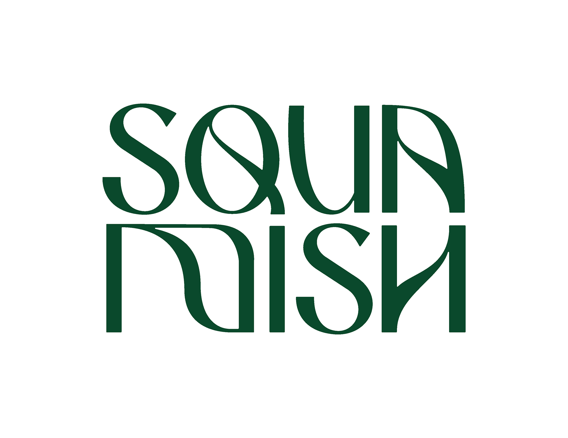
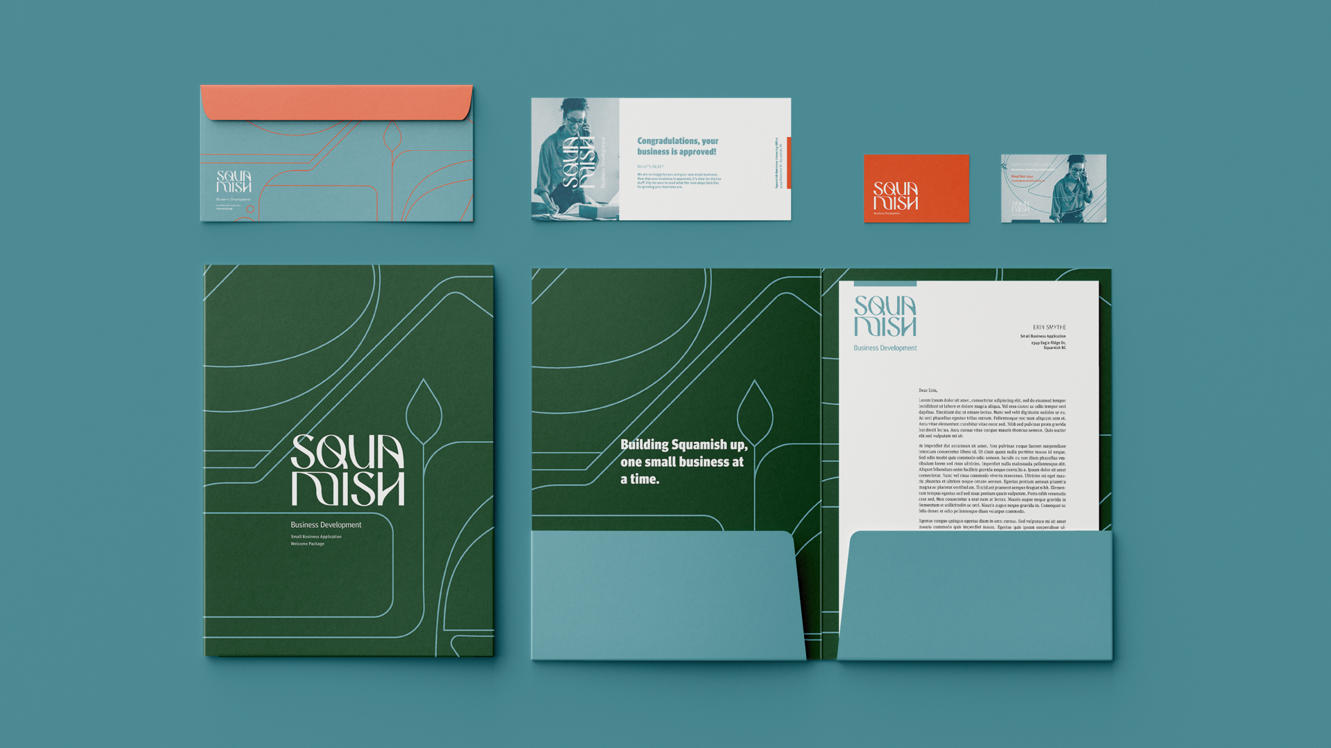
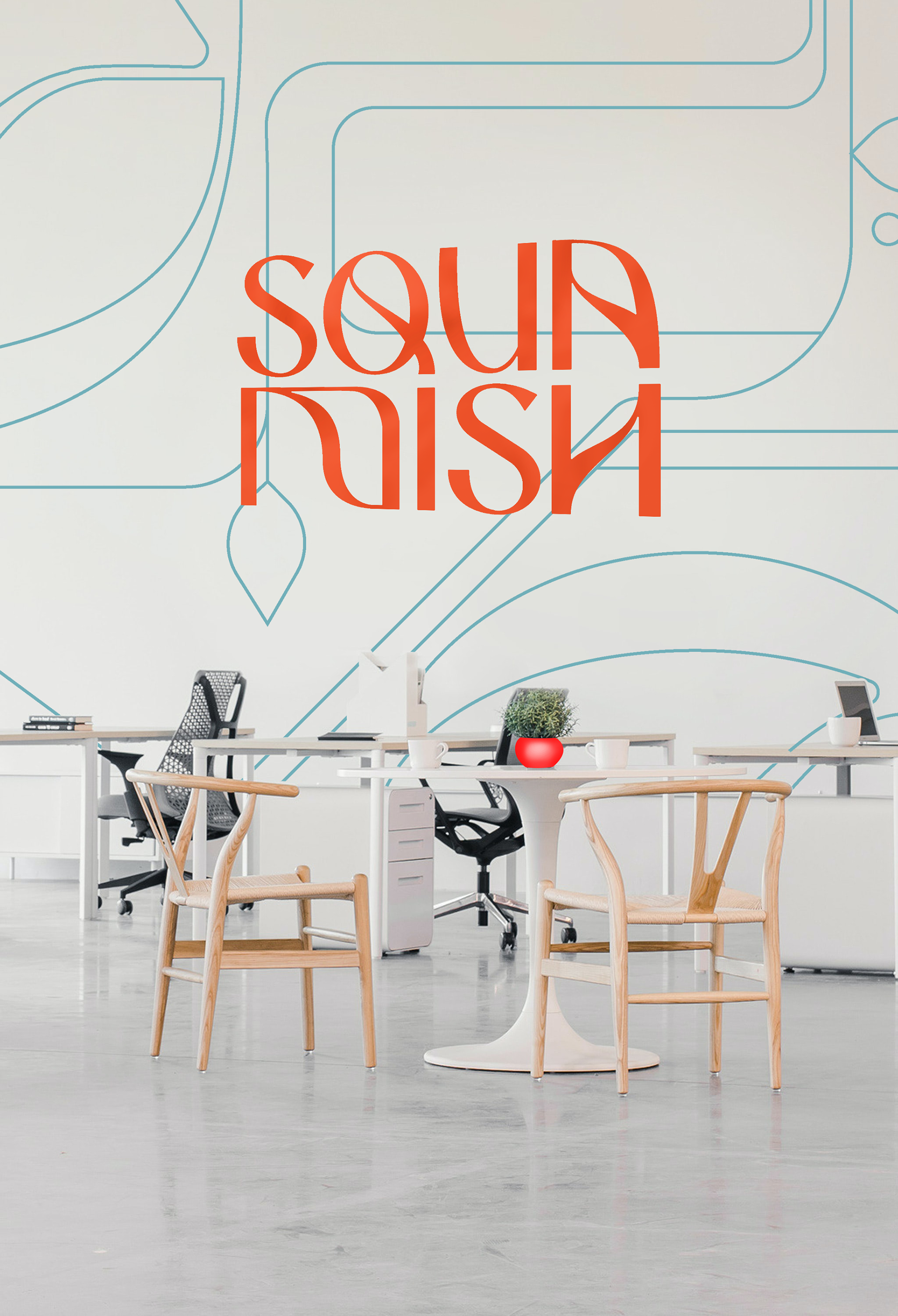
Logo Rationale
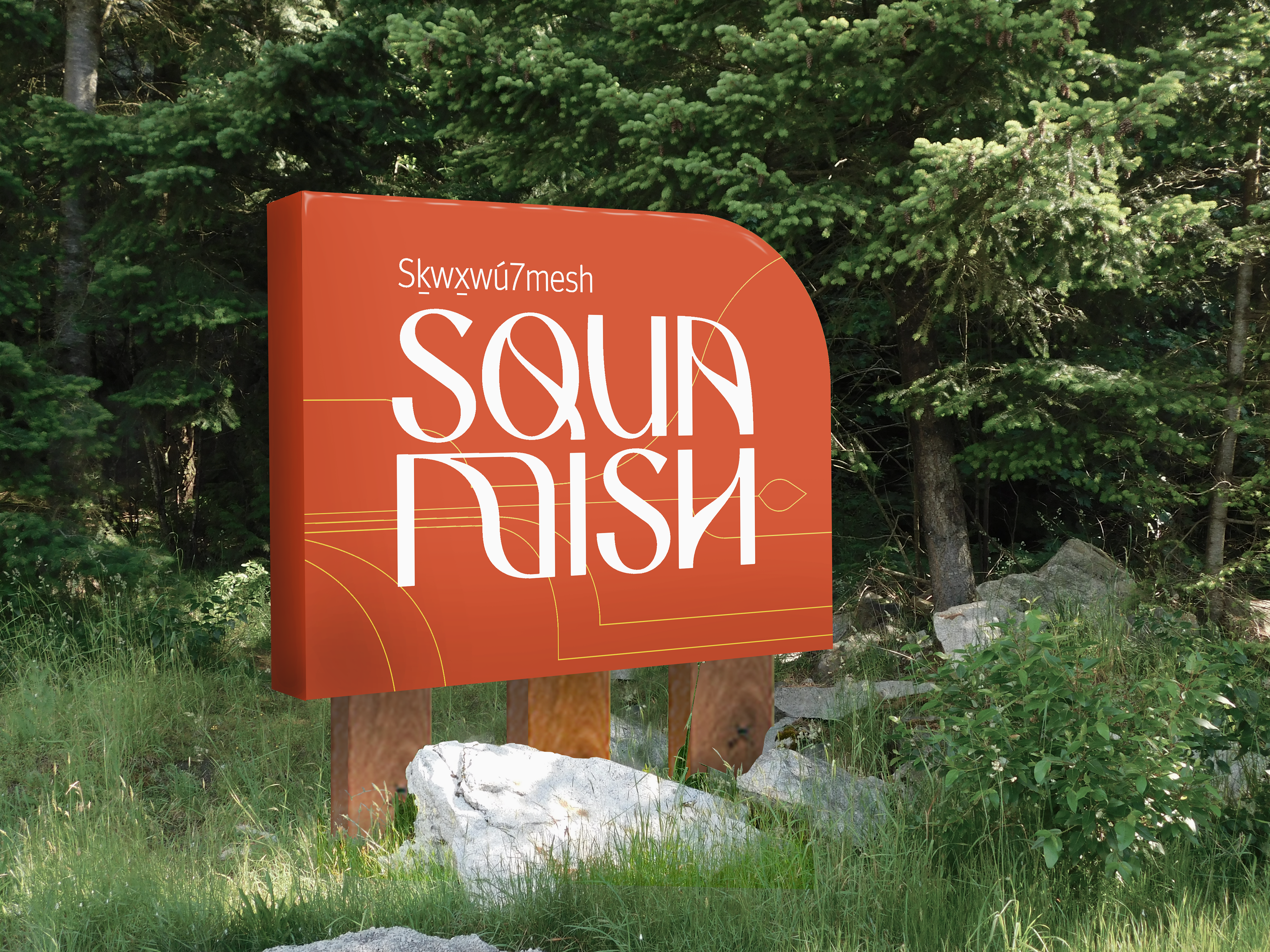
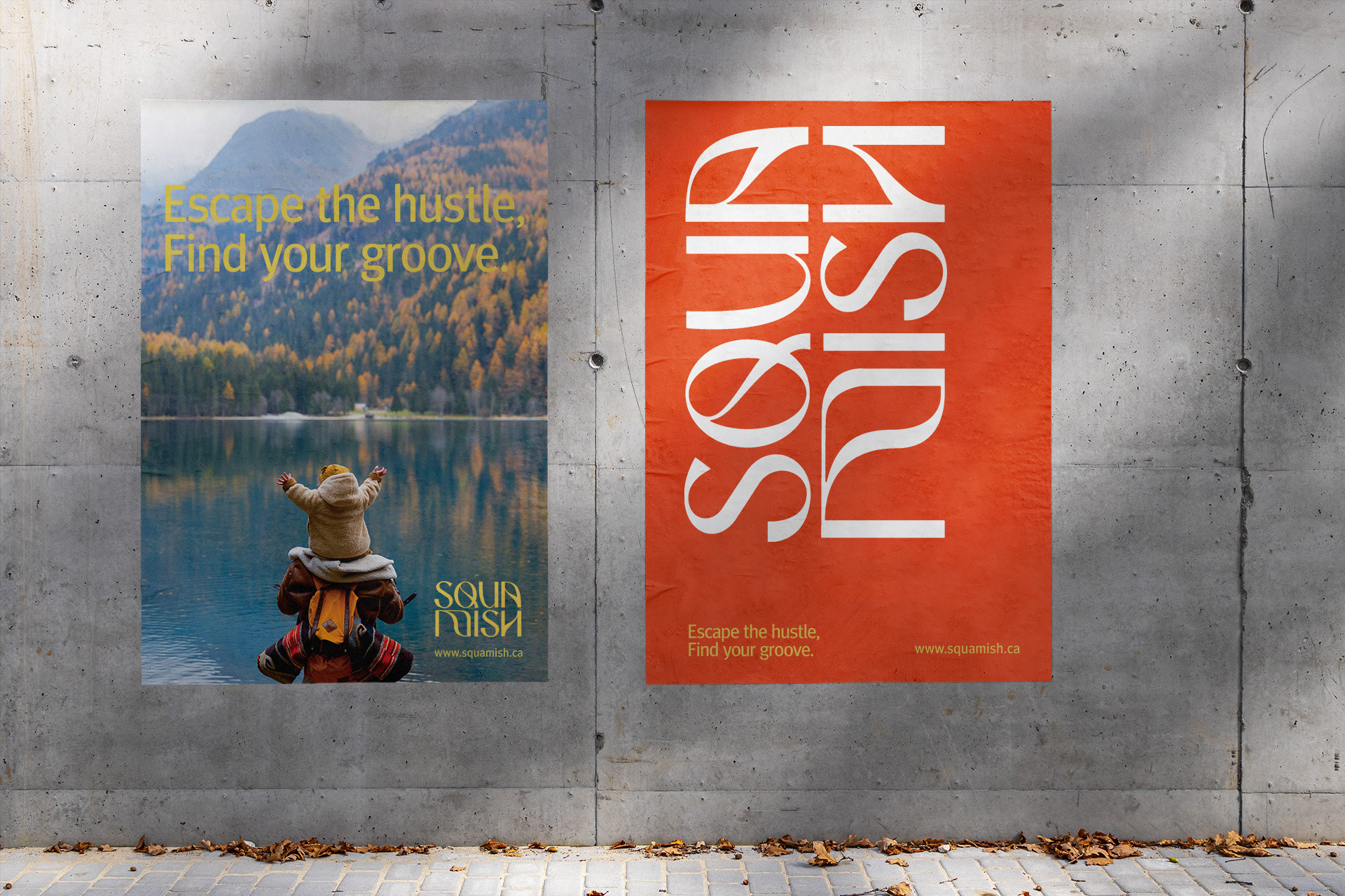
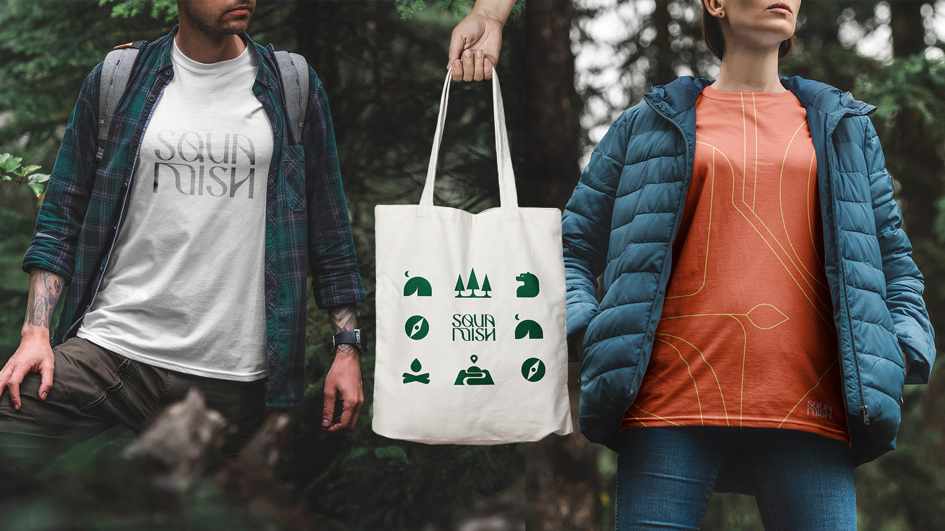
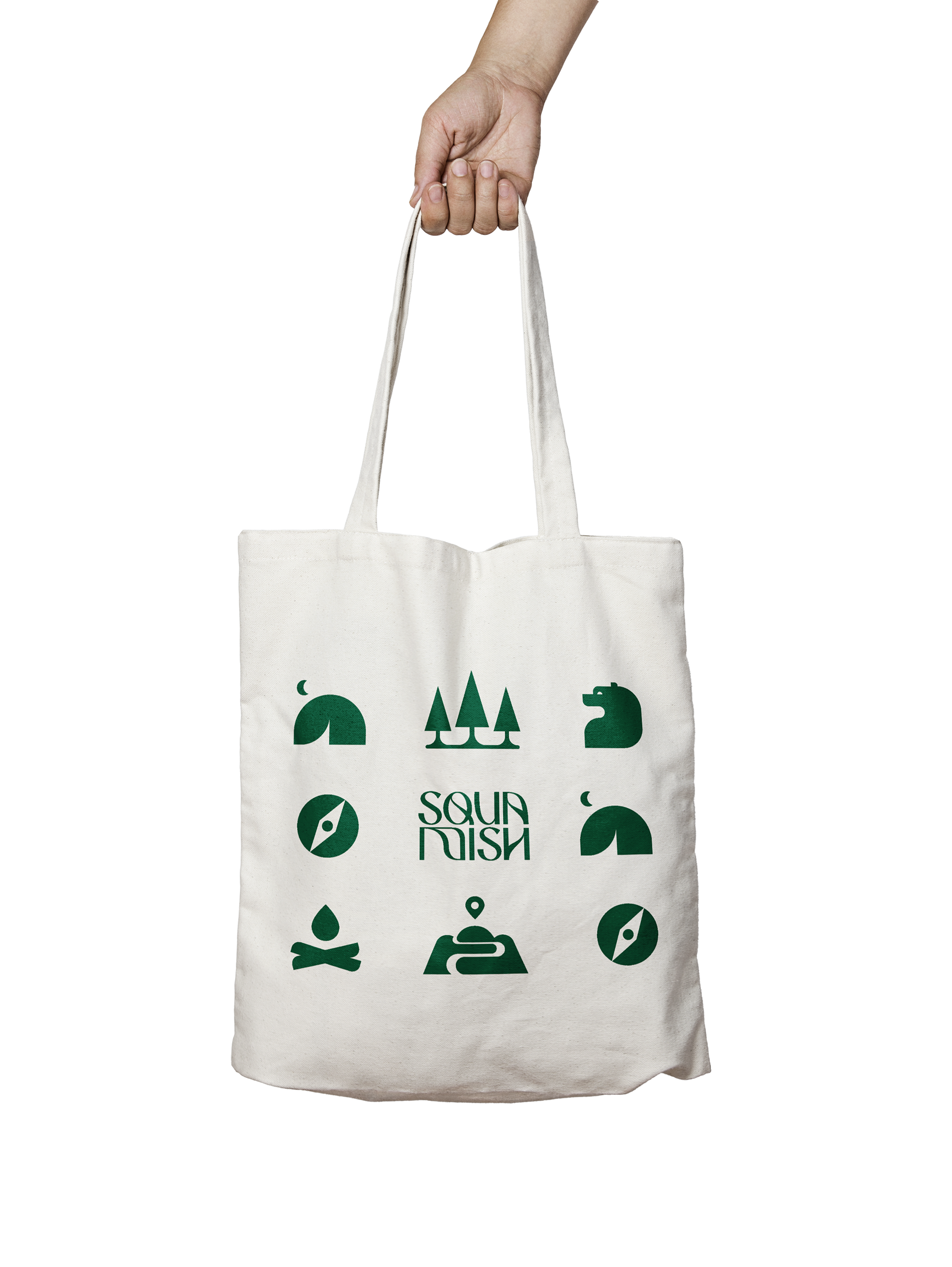
Squamish is home to many iconic rolling peaks and valleys scaling the Howe Sound. The new identity mark is a modern twist on an old letter style, symbolic of tradition rooted in the present day. It echos the dynamism of the waves, peaks, valleys, wind and trail systems. The new word-mark is an expression of the intensity and fluidity of Squamish’s lifestyle and personality.
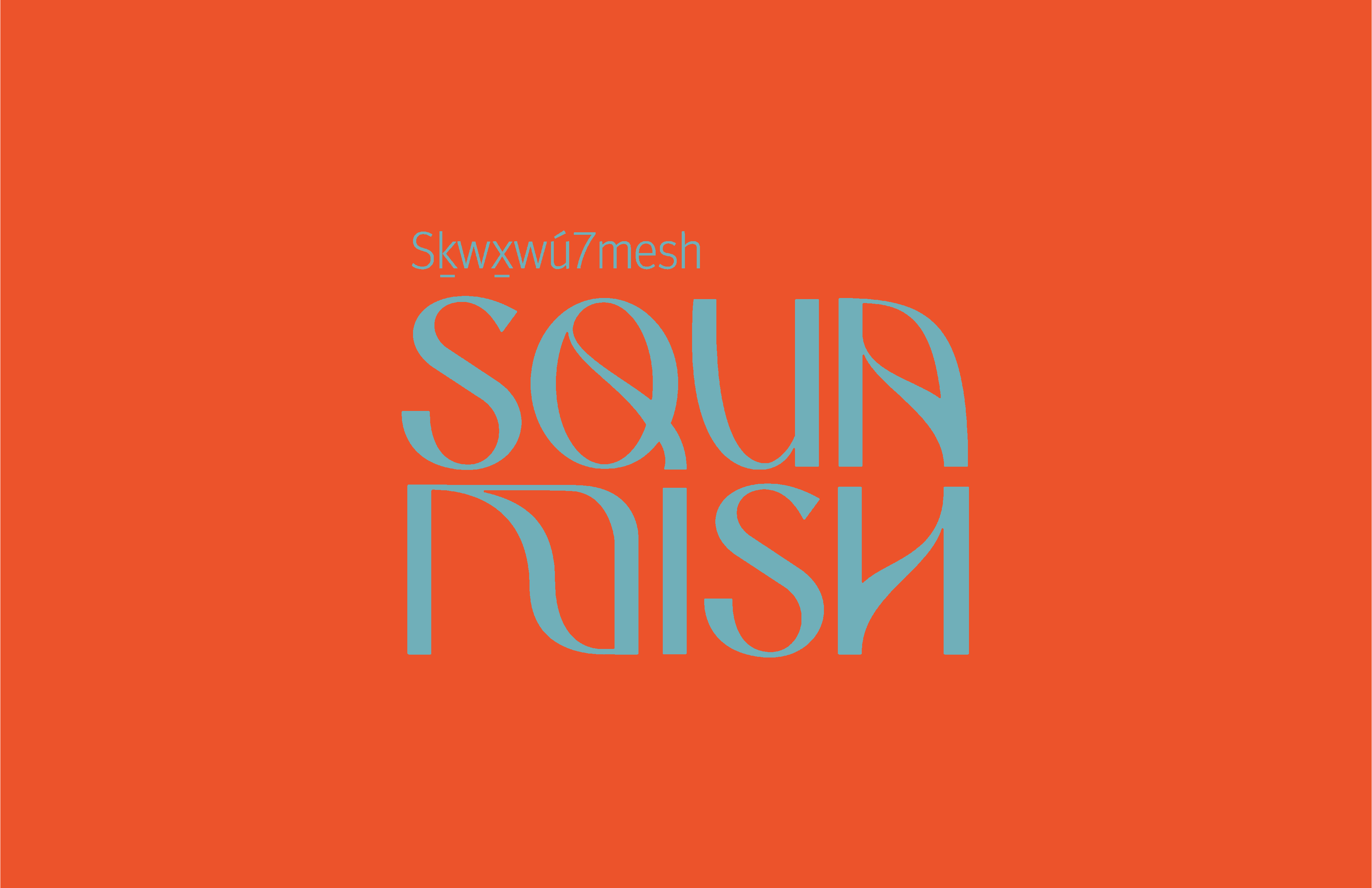
“Sḵwx̱wú7mes” means “mother of the wind” or strong wind blowing up a fjord. This naturally asks for an organic, flowing form. “Squamish” is borrowed from the Sḵwx̱wú7mes People and owes respect to the name by pronouncing it properly. Squamish is correctly pronounced with a glottal stop between SQUA and MISH. The stacking of the two syllables is a simple design choice that may impact the long-term pronunciation.

Main Demogrpahic
Most people currently living in Squamish are educated, trade focused, mid aged (30-50 years old), outdoor enthusiasts, making over $120k a year (per household). They chose Squamish for its liveability, safety, and quality of life. They value mental and physical wellbeing, tight knit community, environmental consciousness, and the safety of their families. Squamish needs an edge that is as rad as the people living there.
TARGET AUDIENCE
Demo: 25-40 years, educated, trades, 120k per household/ year.
Psycho: Entrepreneurial, outdoor enthusiasts, driven by lifestyle.
Decisions as simple as changing the restroom icons from gendered people to a toilet, to making government projects accessible to the public, have huge impacts. By designing digestible resources and intuitive government forms and using representation, Squamish can profoundly improve their citizen engagement in political affairs and community initiatives.
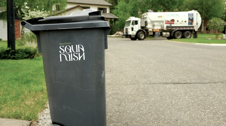
The new brand embraces a modern world. It acknowledges the diversity of its community and works towards inclusivity and accessibility for locals.
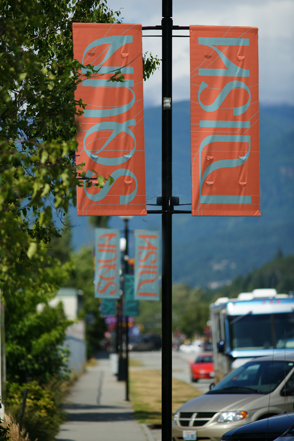
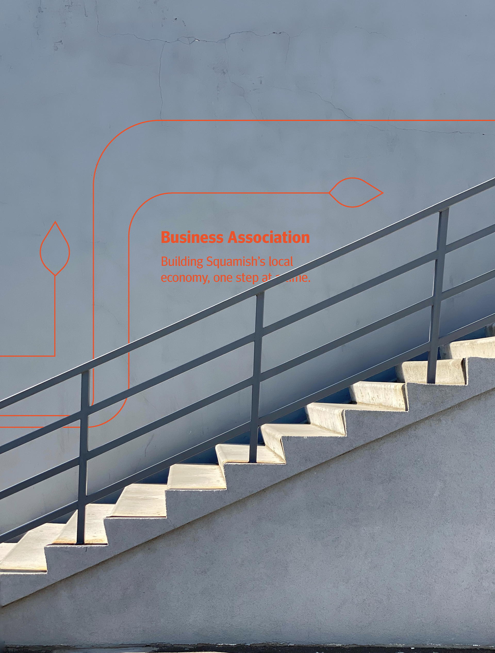
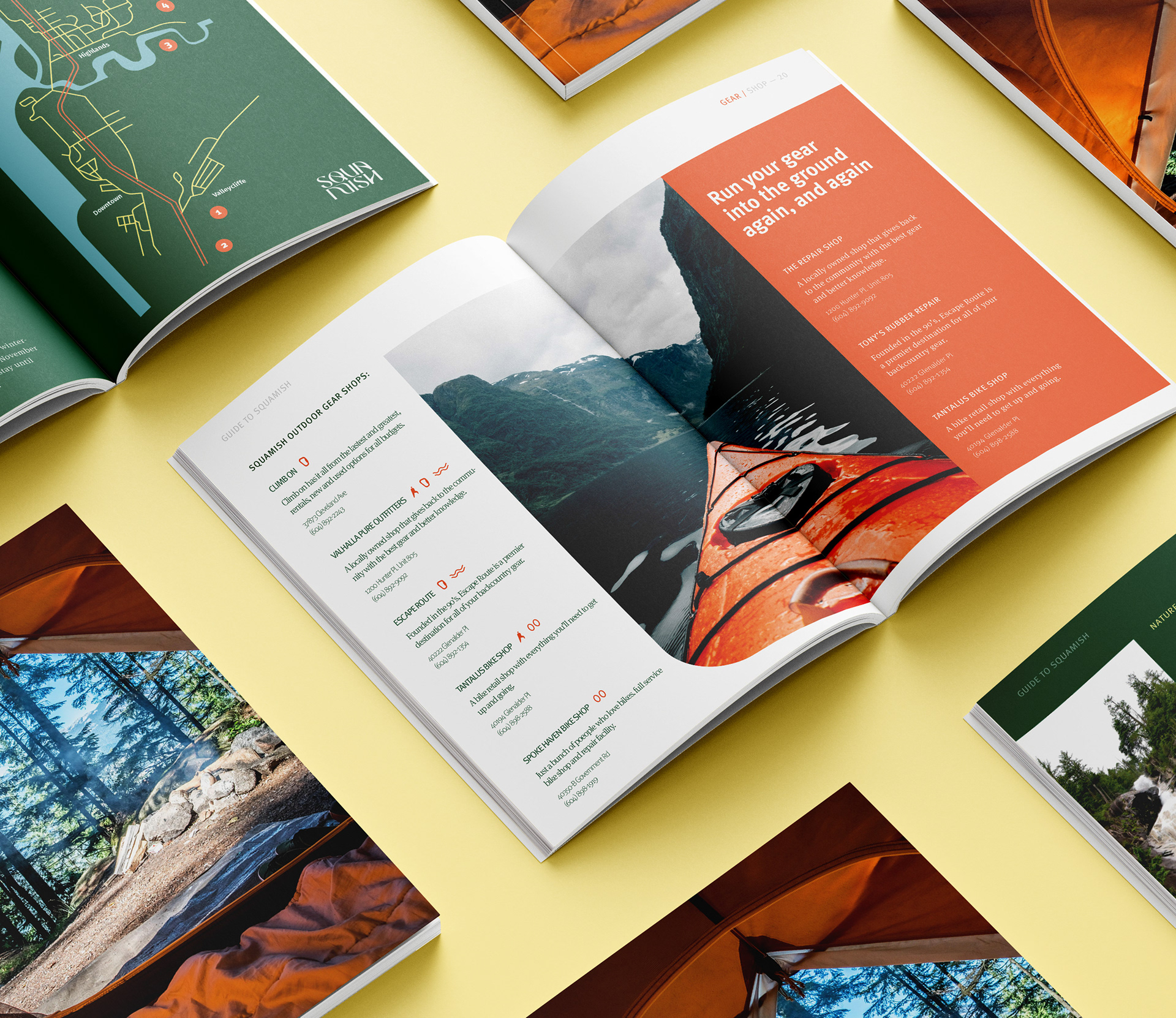
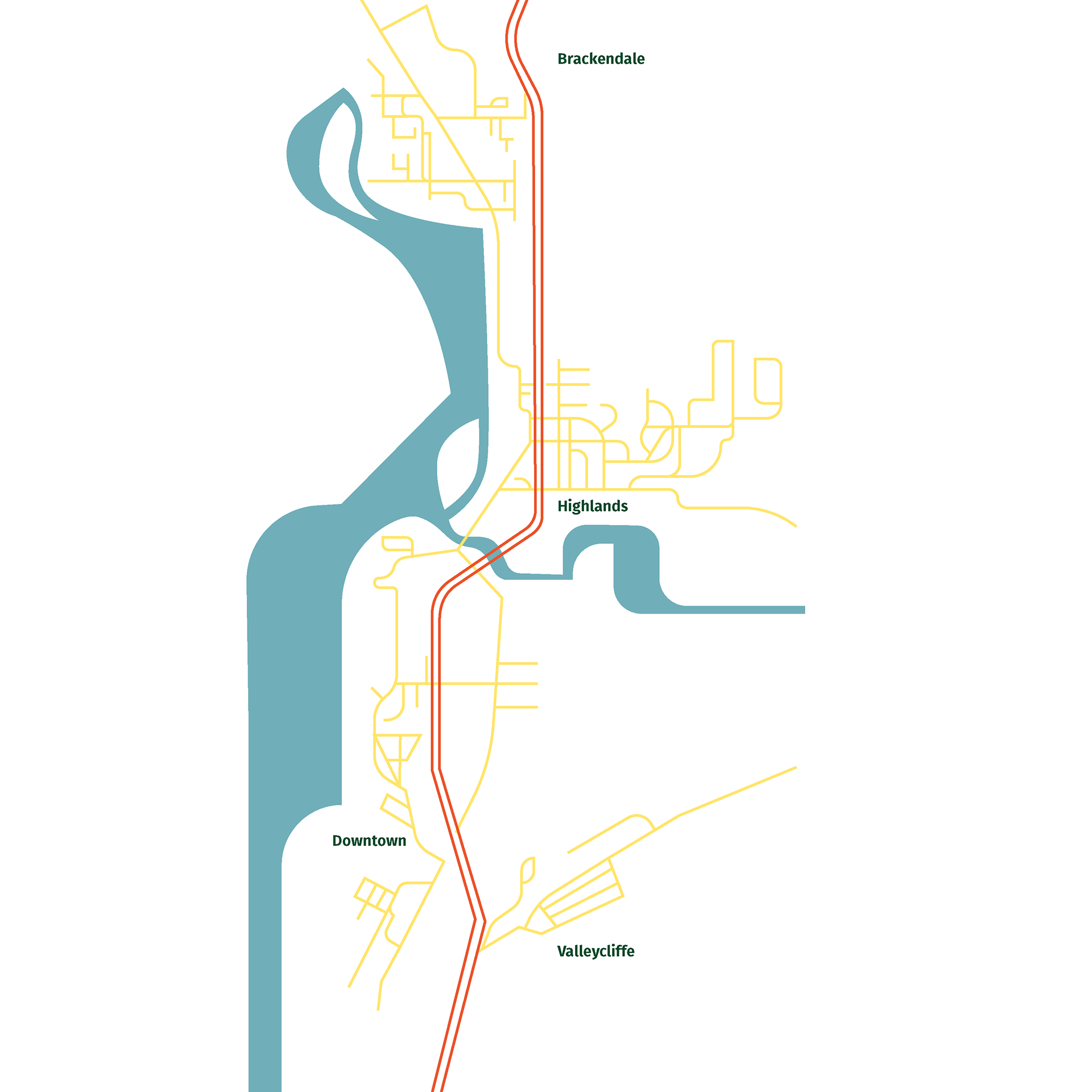
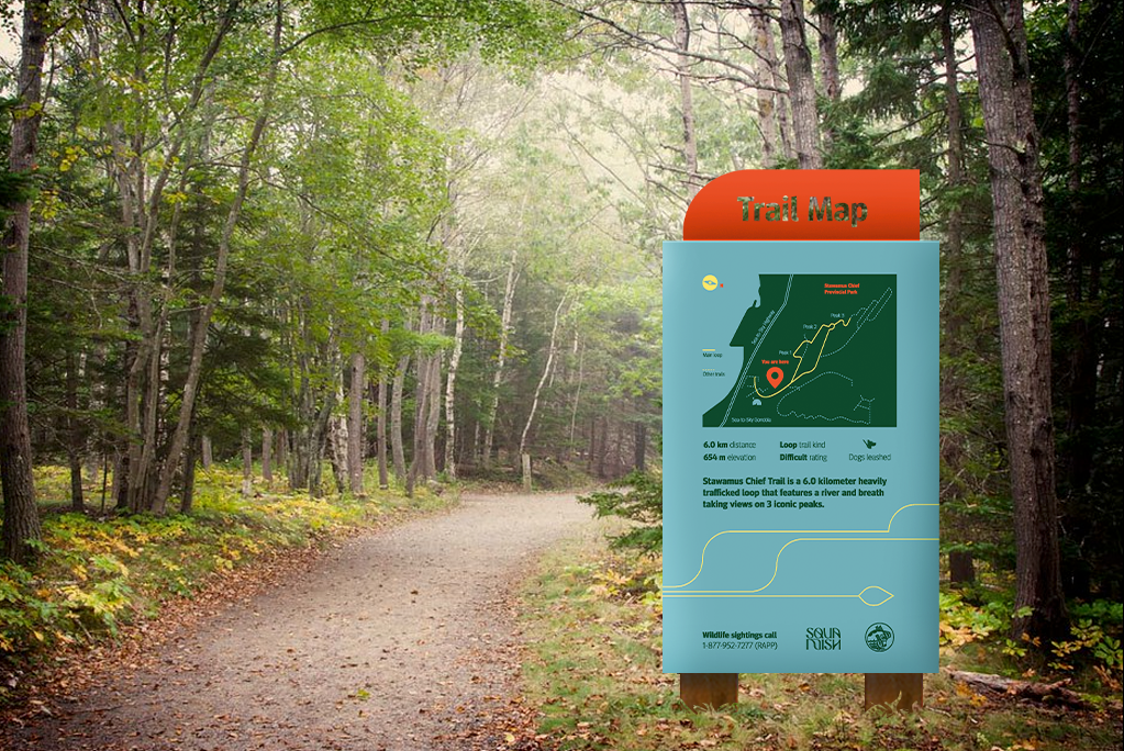
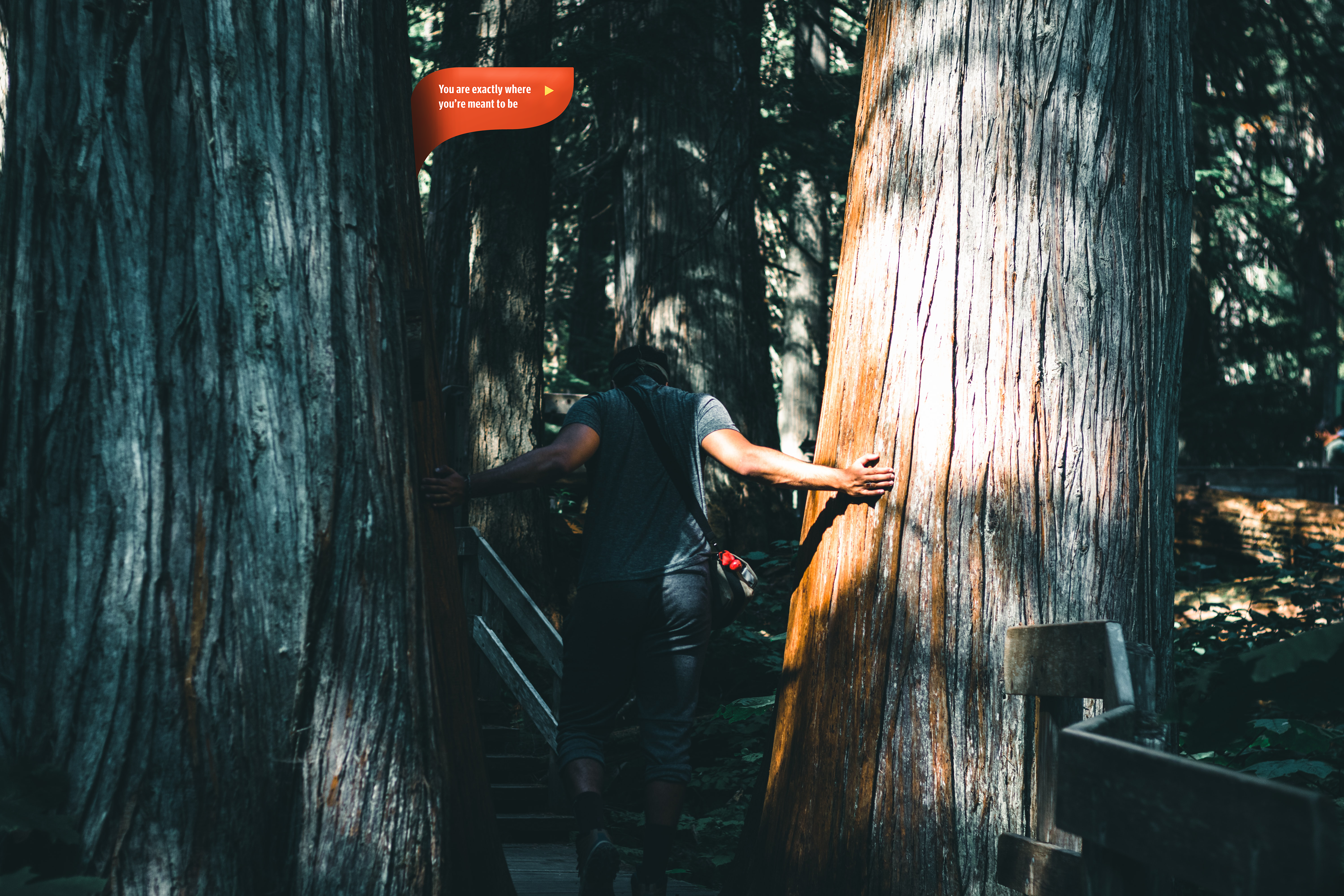
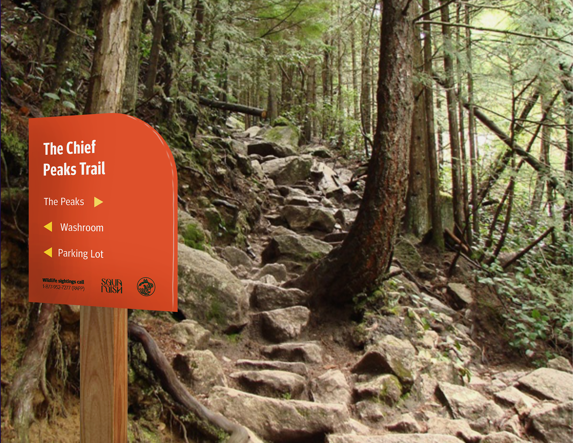
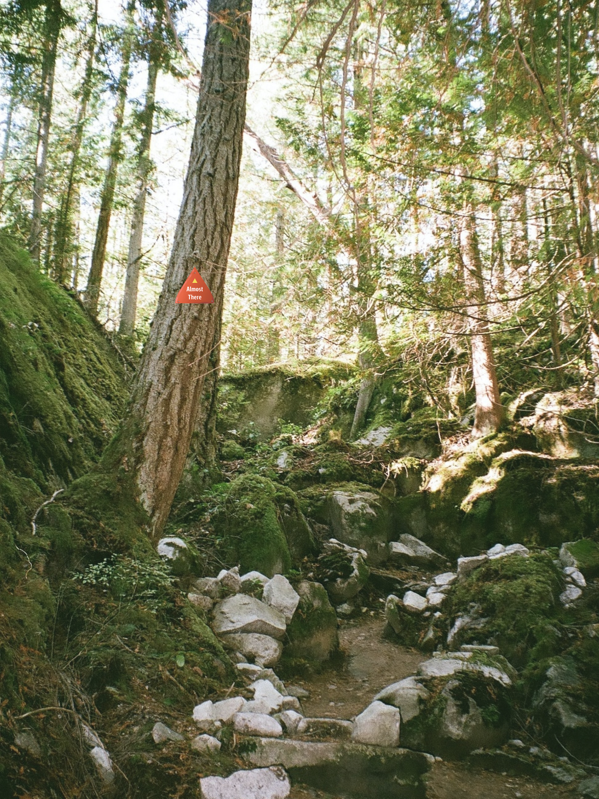
Signage & Way-finding
Signage is an integral part of the identity of a city's brand. Being the outdoor haven that it is, Squamish has the opportunity to make hiking, biking and climbing routes easily navigable with comprehensive signage and indications. Not only does this make trails easier for people to use, but helps to conserve the forest floor in areas where people tend to get lost and veer off trail. All of my signage is an extrapolation from the fluid forms used within the logo.
Messaging
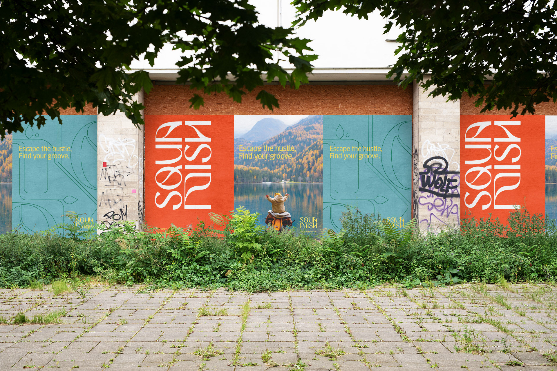
I came up with “Escape the Hustle” as the main tagline for my campaign. It appeals to the desired target because most people moving to Squamish are escaping the hustle of the city to get back to their priorities and live a life that aligns with their values, to reconnect with themselves, nature, all while doing the things they love to do. My messaging is pretty laid back, appealing to a young audience with the ambition of living their lives beyond the confinement of city life.
Define your path,
Get your grip,
Get back to living,
Find yourself, in Squamish


More and more we are being shown the importance of becoming a truly democratic, politically involved society. My goal with this re-brand is that Squamish becomes a city that locals feel invited to engage with, they feel heard and see progress, making big change on a small scale using simple design solutions.
This project was recognized for 2 honourable mentions in the branding category of the DesCan Salazar Awards, and Applied Arts, 2022.