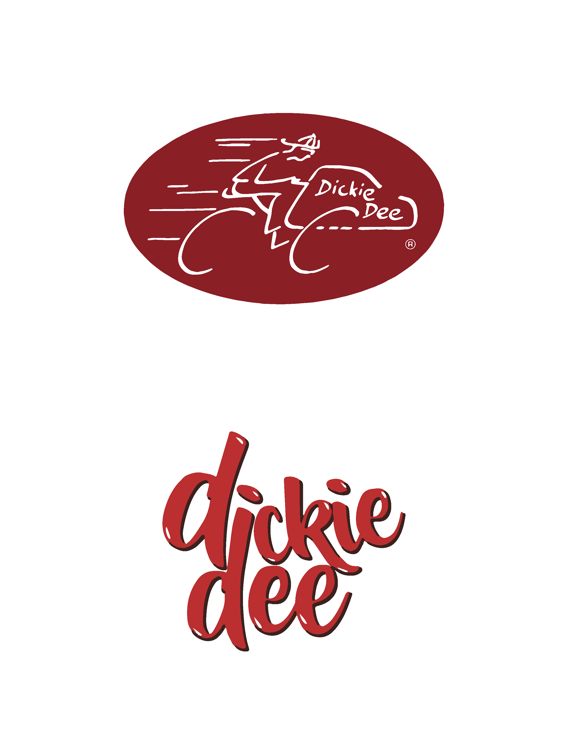


Brand History
It all started in Winnipeg, Manitoba, then grew across the rest of Canada. Dickie Dee is an iconic piece of Canadian summer for many who grew up in the 80-90’s. With more than 1500 independent ice cream retailers at their prime, Dickie Dee was the truck to be chasing on a hot sunny day. They had a fleet of tricycles, trucks, and scooters with hand painted logos and signage.
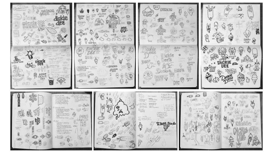
Ideation
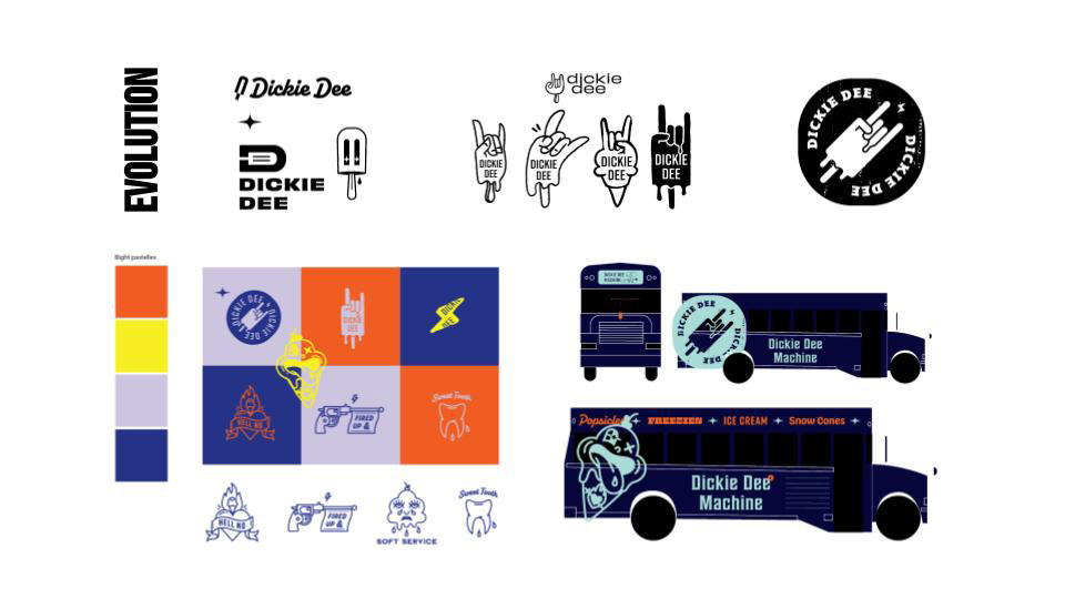
Process Evolution
Approach
Using nostalgia and a modern edge, this rebrand brings Dickie Dee back to life in a highly competitive market. The old identity was inconsistent and unreliable, the goal of this rebrand is to #MakeDickieDeeCoolAgain.
The primary demographic is Canadians who grew up with Dickie Dee at its peak popularity in the 80’s-90’s. Parents between the ages 30-40, with their kids looking for a frozen treat out on the streets. The parents have fond memories from when they were kids of weirdly shaped popsicles, hand painted tricycles and chasing down the Dickie Dee boys with their friends.
The primary demographic is Canadians who grew up with Dickie Dee at its peak popularity in the 80’s-90’s. Parents between the ages 30-40, with their kids looking for a frozen treat out on the streets. The parents have fond memories from when they were kids of weirdly shaped popsicles, hand painted tricycles and chasing down the Dickie Dee boys with their friends.
Awards Received:
Applied Arts Brand Identity Program, 2022
RGD Award for Retail Design, 2022
Project Type: Rebrand
Creative Direction: Jeff Harrison

Logo rationale
Ice cream trucks and their tunes are virtually inseparable. This rebrand is inspired by music, and the streets that Dickie Dee weaves. The new logo combines a popsicle and the hand symbol for “rock on”. This concept evolves the musical aspect of Ice cream trucks to be more supportive of local musicians, as well as enjoyable for the neighbourhoods when the trucks pass. Conceptually this mark merges the expressive spirit of music directly with the product (popsicle). Stylistically, It pulls inspiration from the edge of street culture. I brought the Dickie Dee identity to life in this light because it differentiates them from any other competitor, having them take on a niche corner of the market that appeals to its target persona’s attitude. The updated brand carries the sophistication of Dickie Dee forward, as if the old brand were to have grown up along with the kids that used to run curb-side with whatever change they could find behind the couch while still maintaining the fun, indulgent, loud attributes from the past.
COLOR
Vanilla: White
Mint: Pantone 332 CP
Chip: Black
Cherry on top: Pantone 173 CP

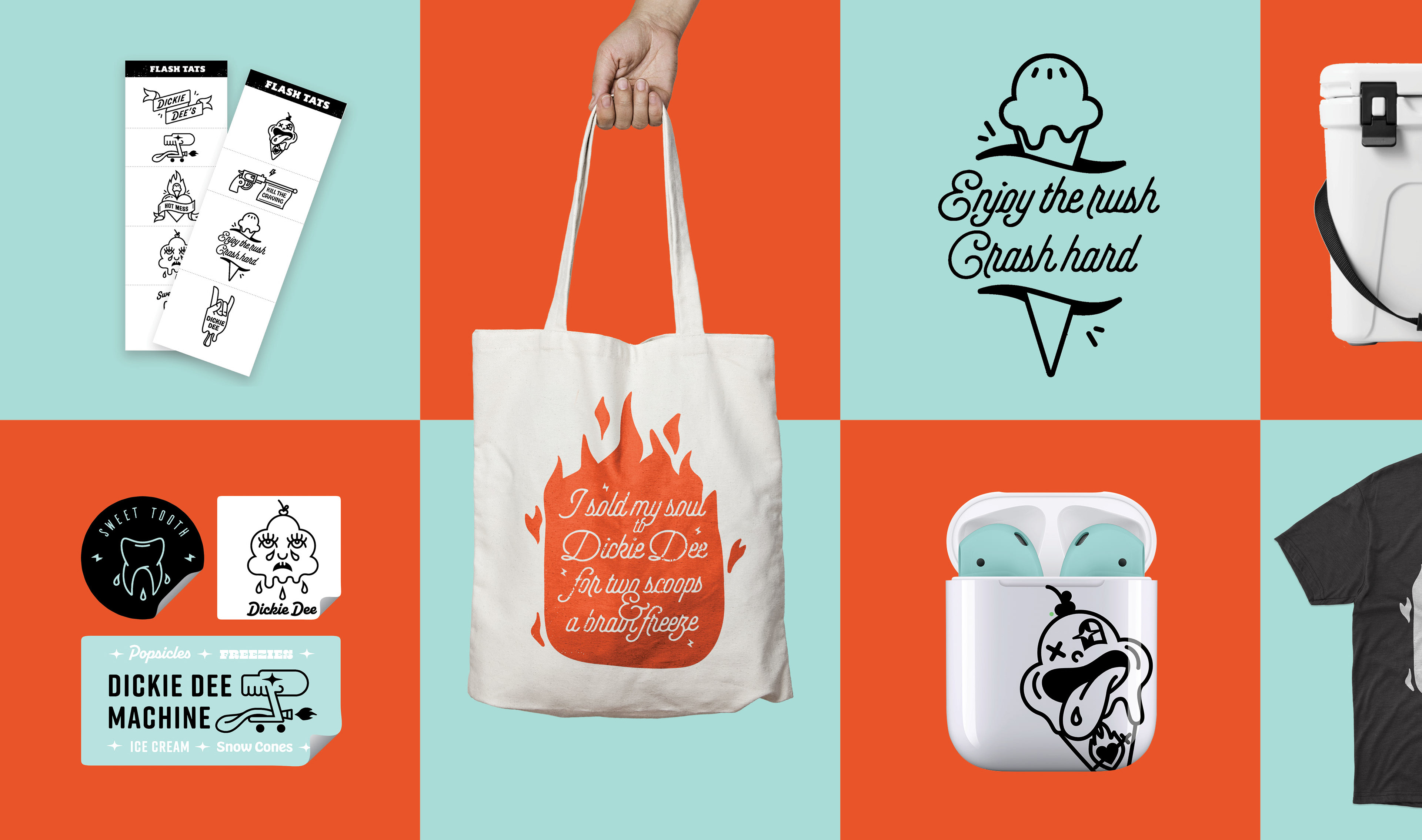
Flash Icons
The many logo variations and icons speak to the variety of flavour, revolving seasonal selection, and spontaneity of choice, as if choosing from a flash tattoo sheet. The wide range of fonts are a subtle acknowledgement of the history of independently hand painted signage from the early days of the brand. The many styles are a visual representation of flavour variety, aiming to encompass the different characteristics of ice cream categories. Millennials have the highest percentage of tattoos compared to any other generation. The feeling behind choosing a tattoo from a flash sheet is familiar and relatable, and gives them another emotional connection to the brands personality, reminding them of a time that was thrilling, spontaneous and indulgent, much like the experience Dickie Dee is trying to create.
TYPEFACES
Rift, Plume, Hobeaux, Alkaline Script, Sedgwick Ave Display, Sheepman, Chivo.
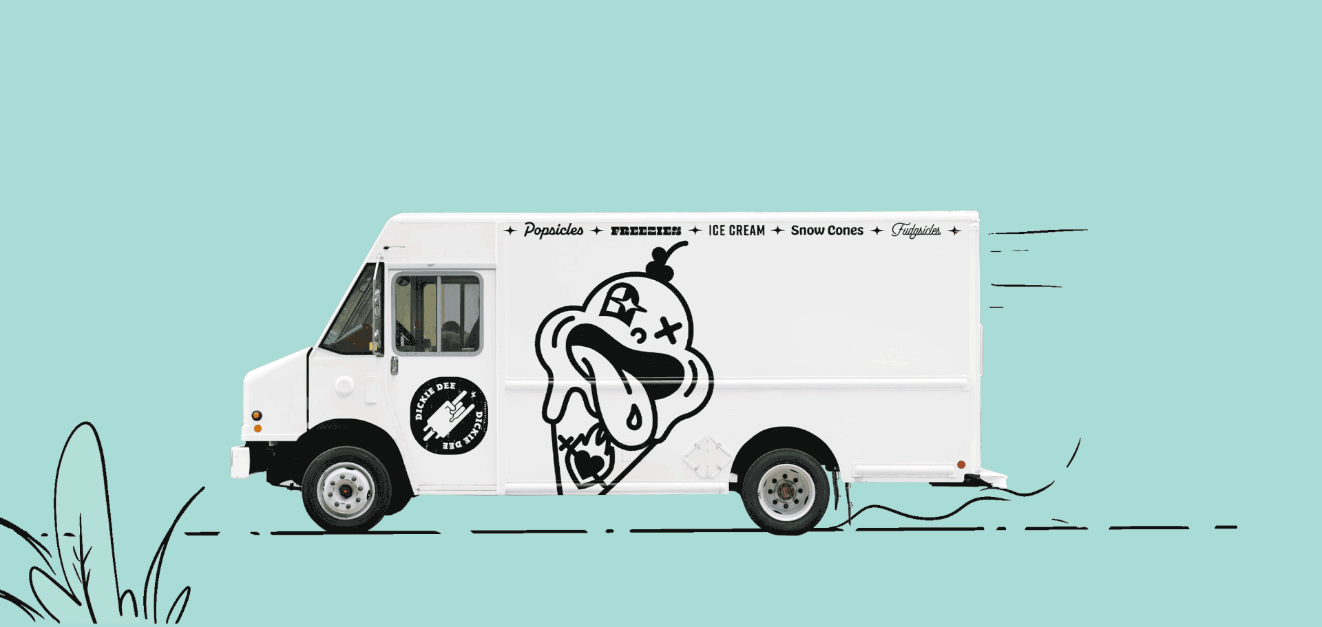
Dickie Dee Machine
The Dickie Dee Machine is the bread and butter of the brand. It is the primary retailer and touchpoint with consumers. It carries it's own sub-identity because it is an independently operated system. To reduce the disappointment of missing the truck, The Dickie Dee Machine is locatable from the website, rooting consumers to its current spot, speed of travel, and destination at all times. Hunting down the truck is half the fun, and the updates makes the thrill of the hunt easy for everyone.

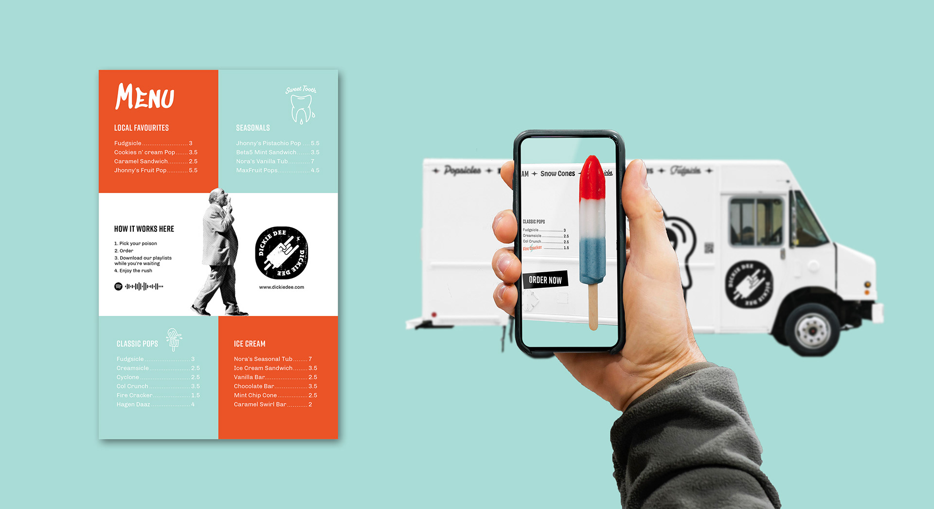
The Order Experience
The new brand is tailored for modern health regulations and accessibility for all levels of comfort. The ordering experience can be completely contactless. People can pre-order from the website, hunt down the truck to pick up their treats, or use their smartphones to project the interactive menu on to the side of the truck, or have the option of old fashioned print out menu's and ordering from the staff member, pay online, or pay in person. While they're waiting, consumers are provided with Dickie Dee's Spotify account with weekly playlists featuring local musicians, and fun new tunes to try. This redirects the association of ice cream trucks and music from an obnoxious, insensitive one, to one that is more considerate, explorative and engaging. Dickie Dee Machines would be made available for event catering.
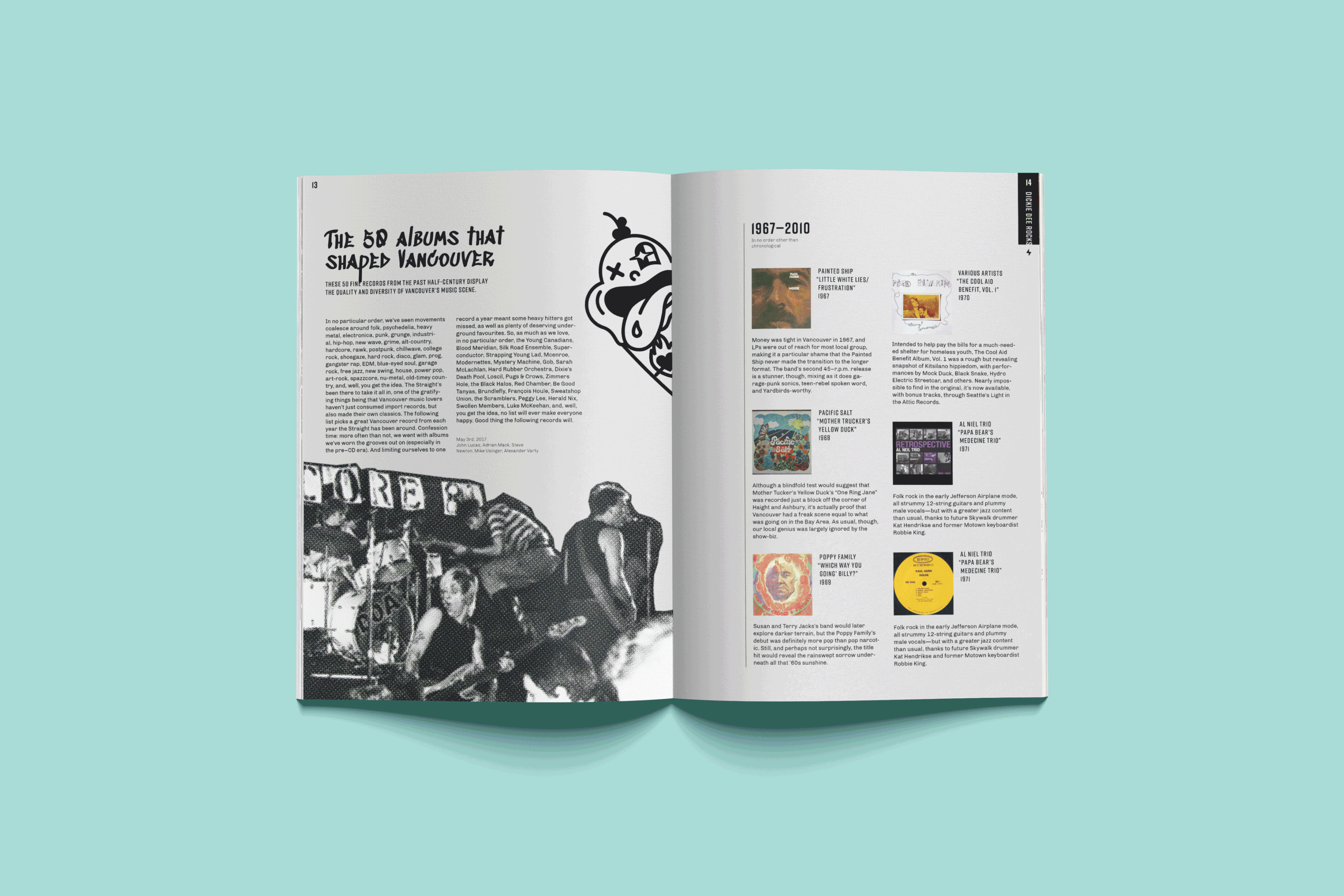
Lifestyle Zine
Playing into street culture and the music scene, the Dickie Dee Zine is a quarterly publication. It gives a platform to Canadian artists, features various sports such as skateboarding and rollerblading and other street related activities, all the while incorporating content about the history of the brand, consumer stories and current updates and events.
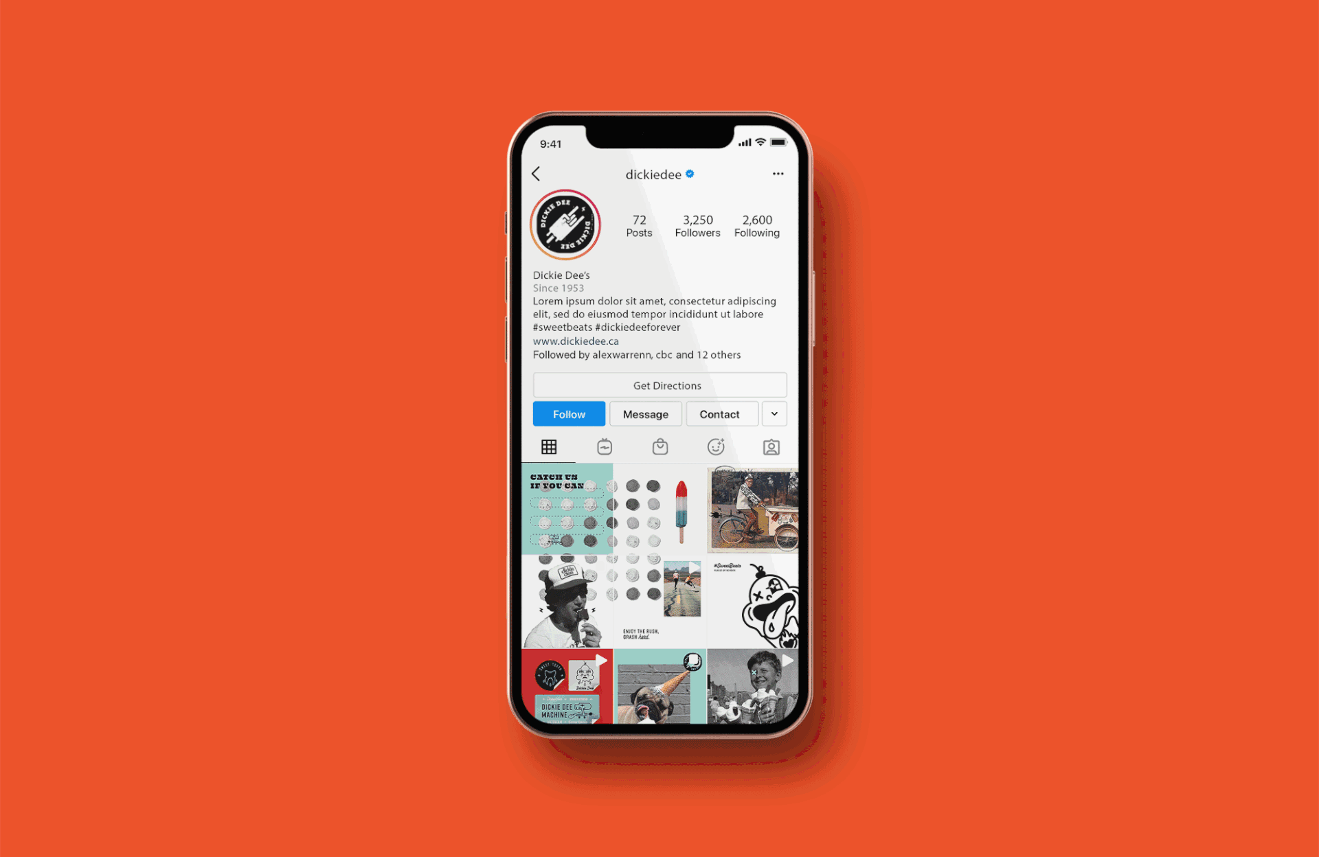
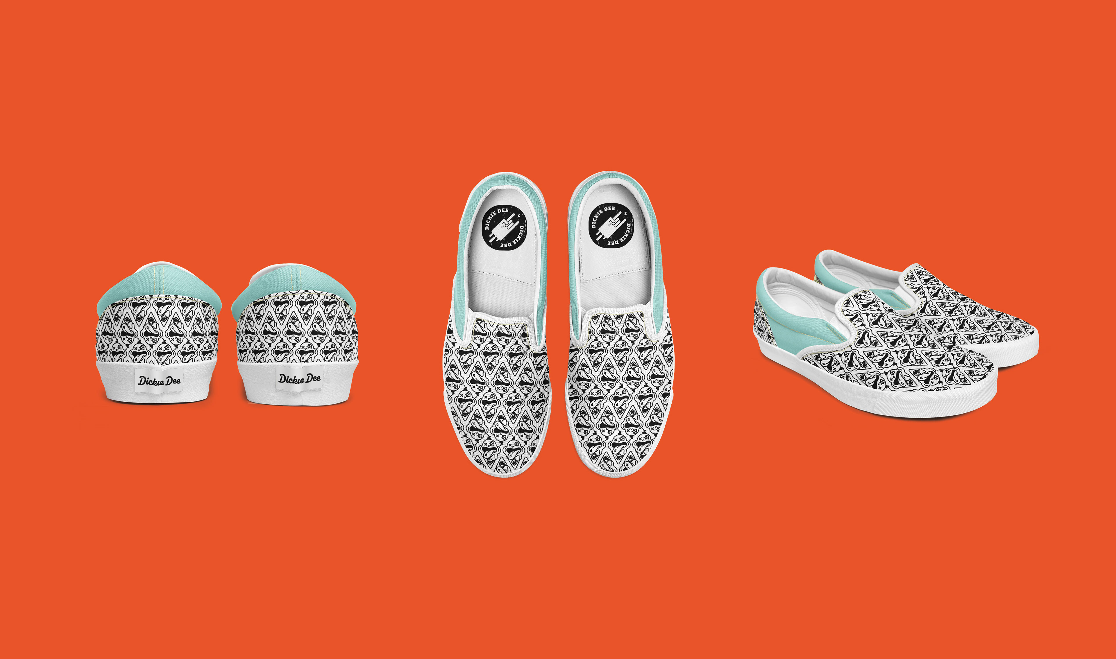
Repping Dickie Dee
Staff uniforms will consist of Dickie Dee flat brim hats, vans, and black or white clothing. Dickie Dee will be focusing a lot of their sales on their merchandise from the website. All merch is customizable, allowing the consumer to mix and match from the 4 brand colours, and series of logos, icons and graphics. Music accessories such as air-pod cases would be available, alongside temporary tattoo sheets and cooler packs for keeping ice cream chilled in, and the standard tote, tee and stickers.


Takeaways
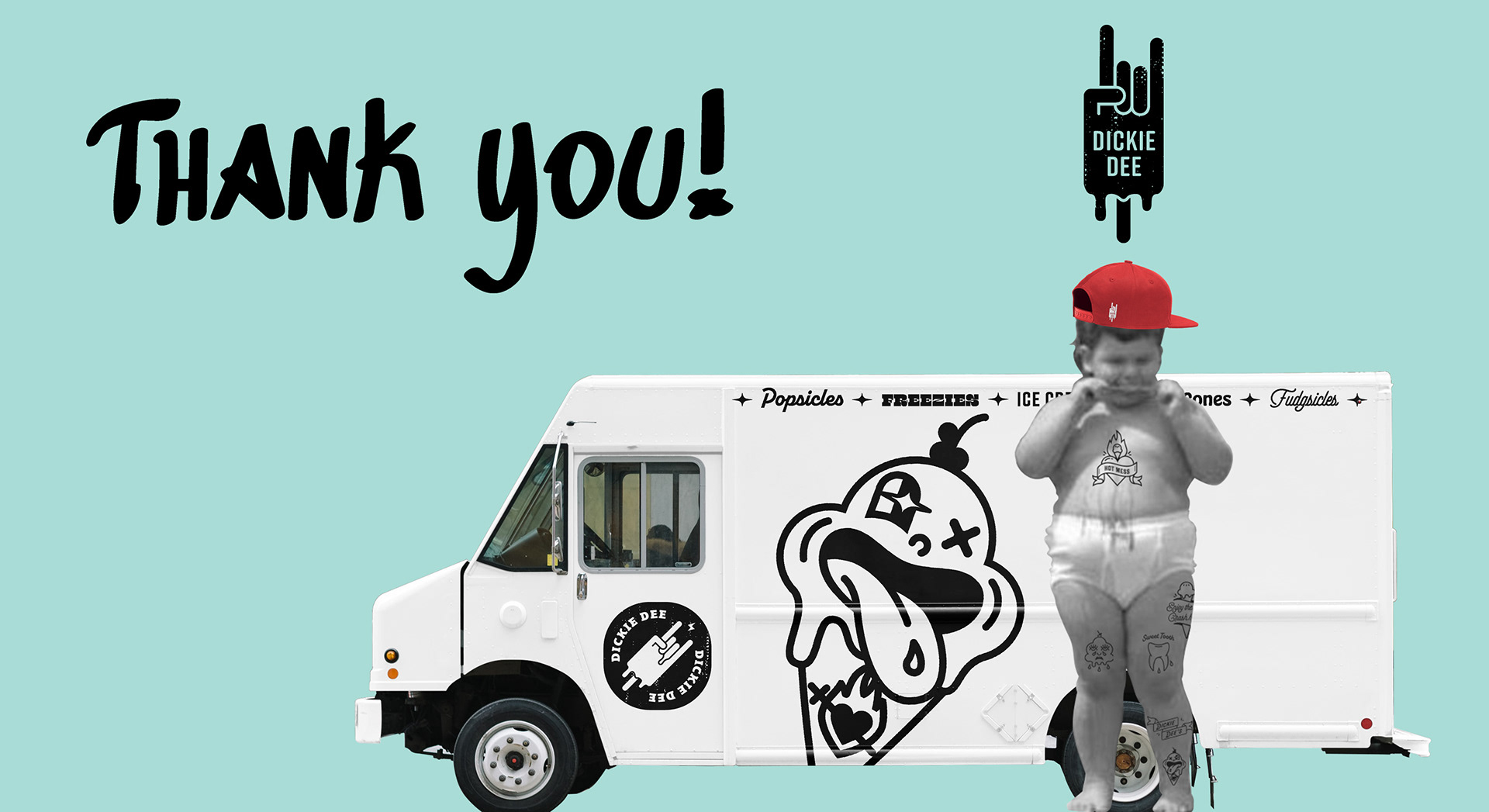
This project was exactly as fun to make as you may have assumed. It was a testament to getting experimental and making weird shit, failing then trying something else. It was an exercise in having fun, trying new tricks, and pushing individual ideas far enough that they all made sense under one cohesive system. Thank you for checking out my work!